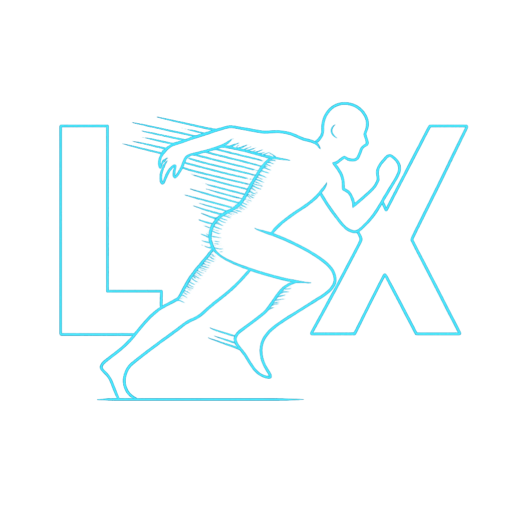
LEJUANIX
LEJUANIX
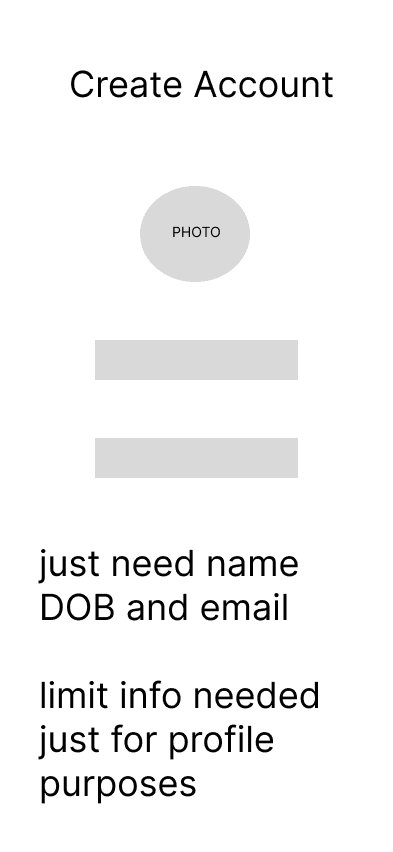
Low-Fi Prototype
I started with quick lo-fi mockups to visualize the experience and iterate fast. I intentionally skipped a login screen to eliminate friction and focus on gamifying the workout journey. Simplicity and engagement were the core goals from the beginning.
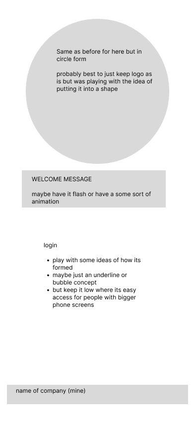
Low-Fi Prototype
I started with quick lo-fi mockups to visualize the experience and iterate fast. I intentionally skipped a login screen to eliminate friction and focus on gamifying the workout journey. Simplicity and engagement were the core goals from the beginning.


Color Selection
I wanted LXFit to feel alive — like stepping into another world. Unlike other fitness apps, this design immerses the user with vibrant, electric colors that spark focus and motivation. Each color was chosen with purpose: Electric cyan symbolizes energy, motion, and alertness — mirroring the feeling of being “switched on.” Neon greens and purples inject futuristic personality and contrast, making every screen feel bold, clean, and immersive. Gradients and glow effects add motion to stillness — guiding the eye without overwhelming it. The goal was to create an atmosphere where the aesthetic alone inspires movement. The glowing gradients, bold neons, and glassmorphism effects aren’t just visual — they elevate the entire experience. I didn’t just want a fitness app. I wanted a visual energy source.

#00FFFF

#0A0A0A

#8000FF

#00FF87
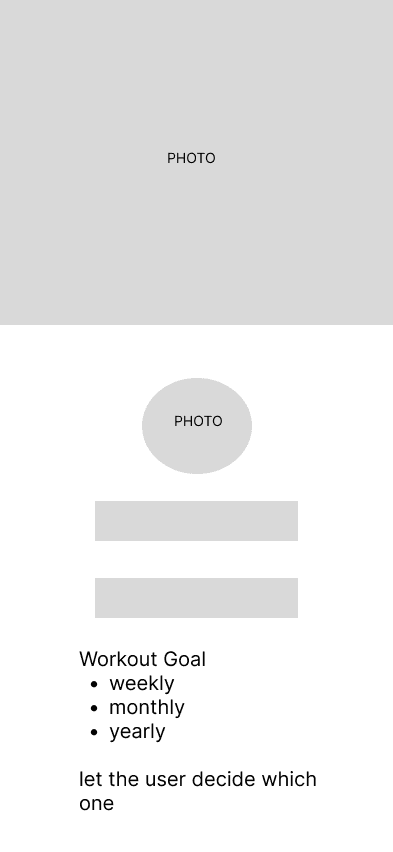
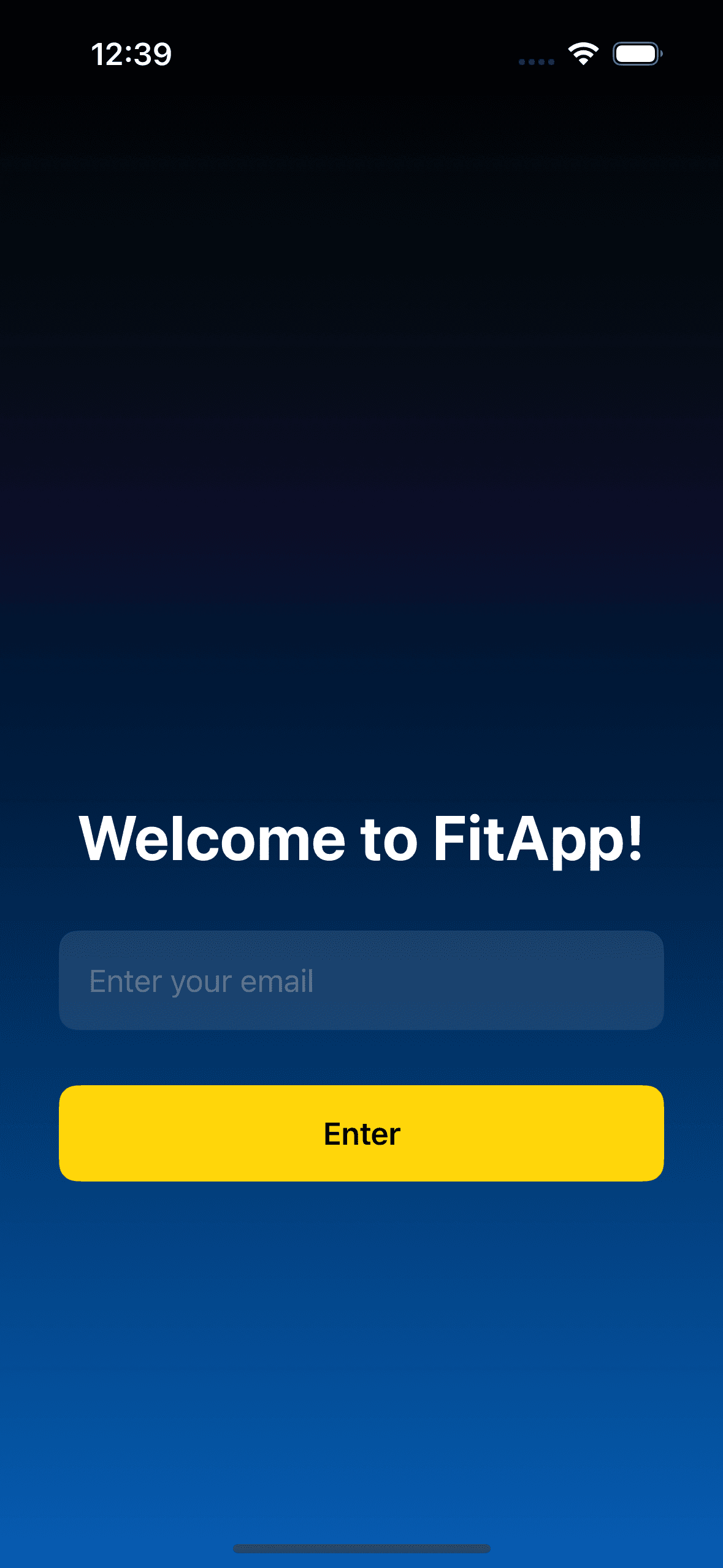
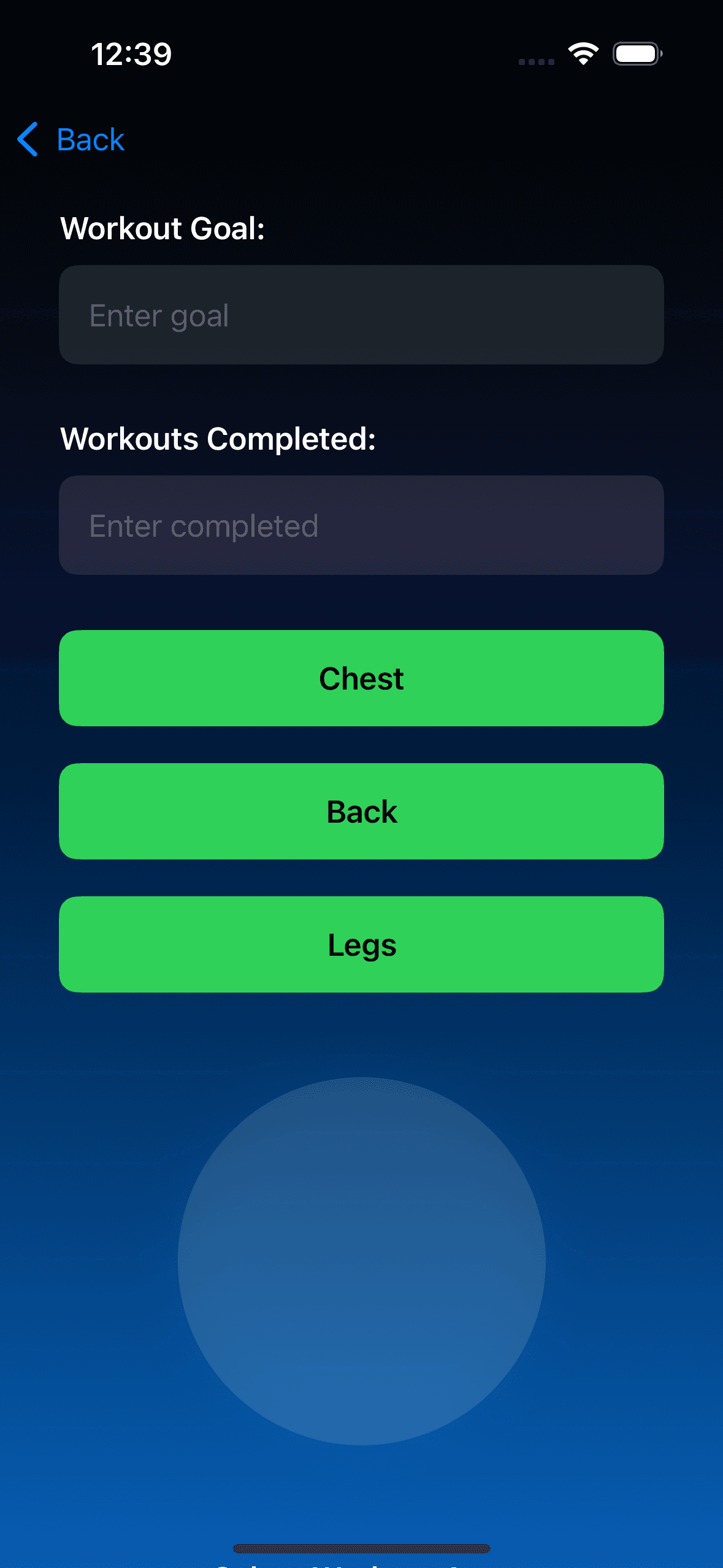
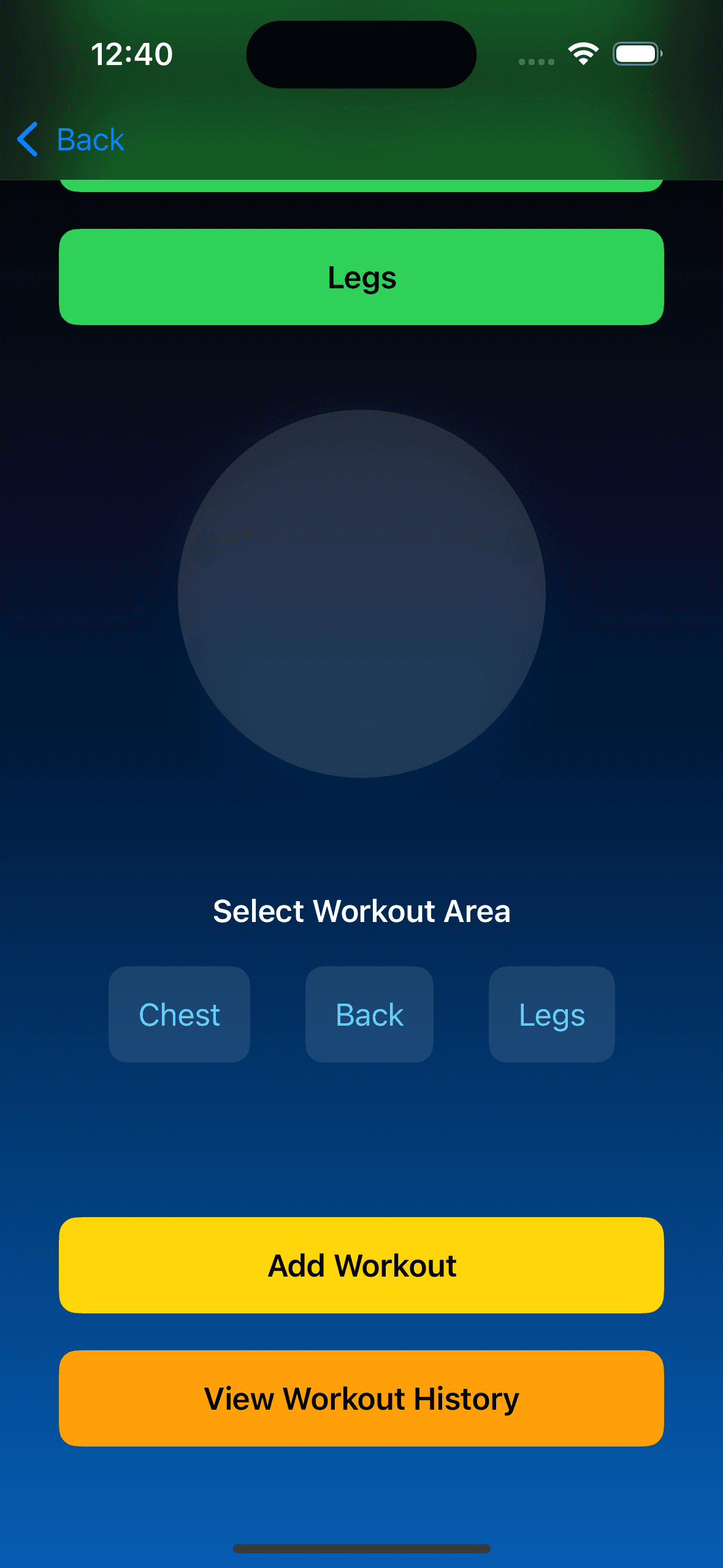
V1 - Version 1
The very first mockup of LXFit. I intentionally designed the layout to be simple, intuitive, and friction-free. The goal was to remove decision fatigue — so users can focus less on navigating and more on moving. I didn’t want users to think their way through the app. I wanted them to feel their way into consistency.
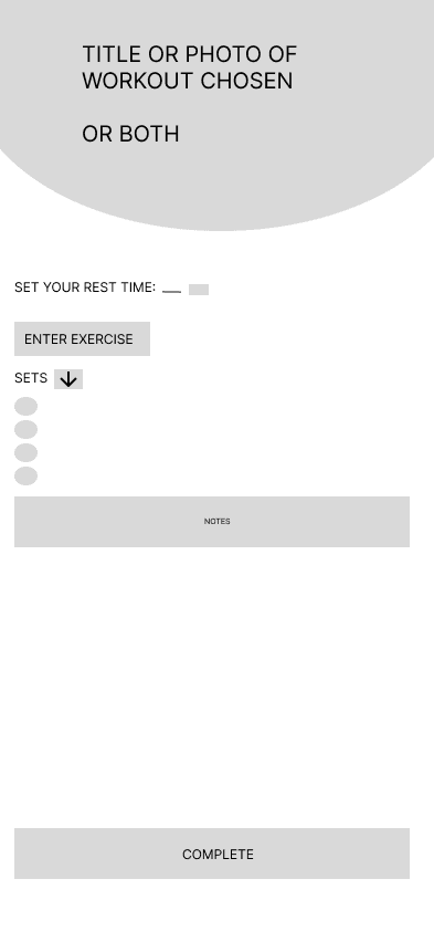


Low-Fi Prototype
I started with quick lo-fi mockups to visualize the experience and iterate fast. I intentionally skipped a login screen to eliminate friction and focus on gamifying the workout journey. Simplicity and engagement were the core goals from the beginning.
Low-Fi Prototype
I started with quick lo-fi mockups to visualize the experience and iterate fast. I intentionally skipped a login screen to eliminate friction and focus on gamifying the workout journey. Simplicity and engagement were the core goals from the beginning.
Color Selection
I wanted LXFit to feel alive — like stepping into another world. Unlike other fitness apps, this design immerses the user with vibrant, electric colors that spark focus and motivation. Each color was chosen with purpose: Electric cyan symbolizes energy, motion, and alertness — mirroring the feeling of being “switched on.” Neon greens and purples inject futuristic personality and contrast, making every screen feel bold, clean, and immersive. Gradients and glow effects add motion to stillness — guiding the eye without overwhelming it. The goal was to create an atmosphere where the aesthetic alone inspires movement. The glowing gradients, bold neons, and glassmorphism effects aren’t just visual — they elevate the entire experience. I didn’t just want a fitness app. I wanted a visual energy source.
#00FFFF
#0A0A0A
#8000FF
#00FF87
Color Selection
I wanted LXFit to feel alive — like stepping into another world. Unlike other fitness apps, this design immerses the user with vibrant, electric colors that spark focus and motivation. Each color was chosen with purpose: Electric cyan symbolizes energy, motion, and alertness — mirroring the feeling of being “switched on.” Neon greens and purples inject futuristic personality and contrast, making every screen feel bold, clean, and immersive. Gradients and glow effects add motion to stillness — guiding the eye without overwhelming it. The goal was to create an atmosphere where the aesthetic alone inspires movement. The glowing gradients, bold neons, and glassmorphism effects aren’t just visual — they elevate the entire experience. I didn’t just want a fitness app. I wanted a visual energy source.
V1 - Version 1
The very first mockup of LXFit. I intentionally designed the layout to be simple, intuitive, and friction-free. The goal was to remove decision fatigue — so users can focus less on navigating and more on moving. I didn’t want users to think their way through the app. I wanted them to feel their way into consistency.